Flutter 的 Scaffold widget 可用來實現基本的 material design layout。
其建構子如下:
Scaffold({Key key, PreferredSizeWidget appBar, Widget body, Widget floatingActionButton, FloatingActionButtonLocation floatingActionButtonLocation, FloatingActionButtonAnimator floatingActionButtonAnimator, List persistentFooterButtons, Widget drawer, Widget endDrawer, Widget bottomNavigationBar, Color backgroundColor, bool resizeToAvoidBottomPadding: true, bool primary: true })
屬性如下:
| Name | Type | Description |
|---|---|---|
| appBar | PreferredSizeWidget | An app bar to display at the top of the scaffold. |
| backgroundColor | Color | The color of the Material widget that underlies the entire Scaffold. |
| body | Widget | The primary content of the scaffold. |
| bottomNavigationBar | Widget | A bottom navigation bar to display at the bottom of the scaffold. |
| drawer | Widget | A panel displayed to the side of the body, often hidden on mobile devices. Swipes in from either left-to-right (TextDirection.ltr) or right-to-left (TextDirection.rtl) |
| endDrawer | Widget | A panel displayed to the side of the body, often hidden on mobile devices. Swipes in from right-to-left (TextDirection.ltr) or left-to-right (TextDirection.rtl) |
| floatingActionButton | Widget | A button displayed floating above body, in the bottom right corner. |
| floatingActionButtonAnimator | FloatingActionButtonAnimator | Animator to move the floatingActionButton to a new floatingActionButtonLocation. |
| floatingActionButtonLocation | FloatingActionButtonLocation | Responsible for determining where the floatingActionButton should go. |
| persistentFooterButtons | List | A set of buttons that are displayed at the bottom of the scaffold. |
| primary | bool | Whether this scaffold is being displayed at the top of the screen. |
| resizeToAvoidBottomPadding | bool | Whether the body (and other floating widgets) should size themselves to avoid the window’s bottom padding. |
| hashCode | int | The hash code for this object. |
| key | Key | Controls how one widget replaces another widget in the tree. |
| runtimeType | Type | A representation of the runtime type of the object. |
方法如下:
| Name | Return Type | Description |
|---|---|---|
| createState() | ScaffoldState | Creates the mutable state for this widget at a given location in the tree. |
| createElement() | StatefulElement | Creates a StatefulElement to manage this widget’s location in the tree. |
| debugDescribeChildren() | List | Returns a list of DiagnosticsNode objects describing this node’s children. |
| debugFillProperties(DiagnosticPropertiesBuilder properties) | void | Add additional properties associated with the node. |
| noSuchMethod(Invocation invocation) | dynamic | Invoked when a non-existent method or property is accessed. |
| toDiagnosticsNode({String name, DiagnosticsTreeStyle style }) | DiagnosticsNode | Returns a debug representation of the object that is used by debugging tools and by toStringDeep. |
| toString({DiagnosticLevel minLevel: DiagnosticLevel.debug }) | String | Returns a string representation of this object. |
| toStringDeep({String prefixLineOne: ‘’, String prefixOtherLines, DiagnosticLevel minLevel: DiagnosticLevel.debug }) | String | Returns a string representation of this node and its descendants. |
| toStringShallow({String joiner: ‘, ‘, DiagnosticLevel minLevel: DiagnosticLevel.debug }) | String | Returns a one-line detailed description of the object. |
| toStringShort() | String | A short, textual description of this widget. |
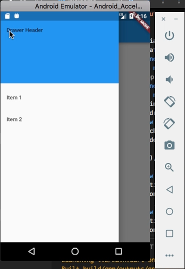
使用上可設定 body 屬性,指定主要區域要呈現的內容。
import 'package:flutter/material.dart';

void main() {
runApp(new MaterialApp(
home: new Scaffold(
body: new Center(
child: new Text('Hello World'),
),
)));
}

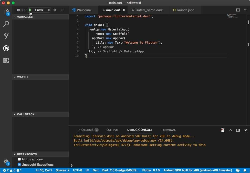
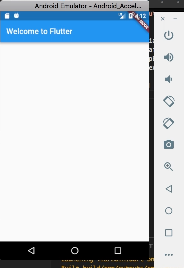
設定 appBar 屬性,指定上方的 Bar。
import 'package:flutter/material.dart';

void main() {
runApp(new MaterialApp(
home: new Scaffold(
appBar: new AppBar(
title: new Text('Welcome to Flutter'),
),
)));
}
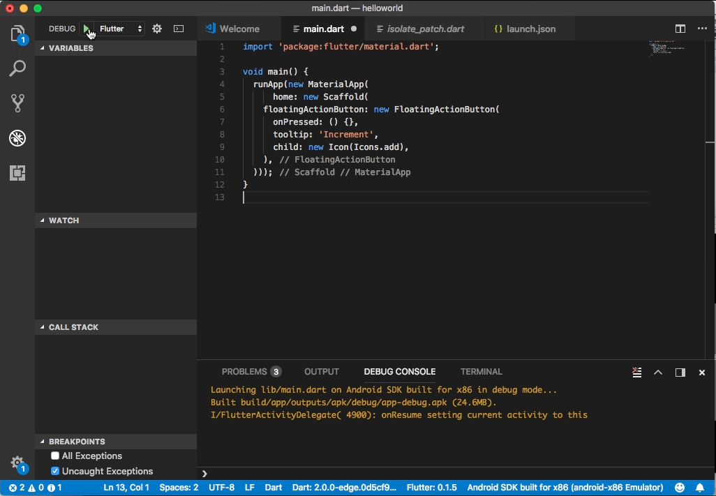
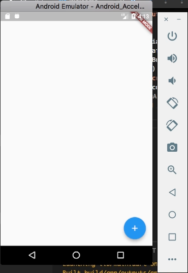
設定 floatingActionButton 屬性,指定 FloatingActionButton 元件。
import 'package:flutter/material.dart';

void main() {
runApp(new MaterialApp(
home: new Scaffold(
floatingActionButton: new FloatingActionButton(
onPressed: () {},
tooltip: 'Increment',
child: new Icon(Icons.add),
),
)));
}
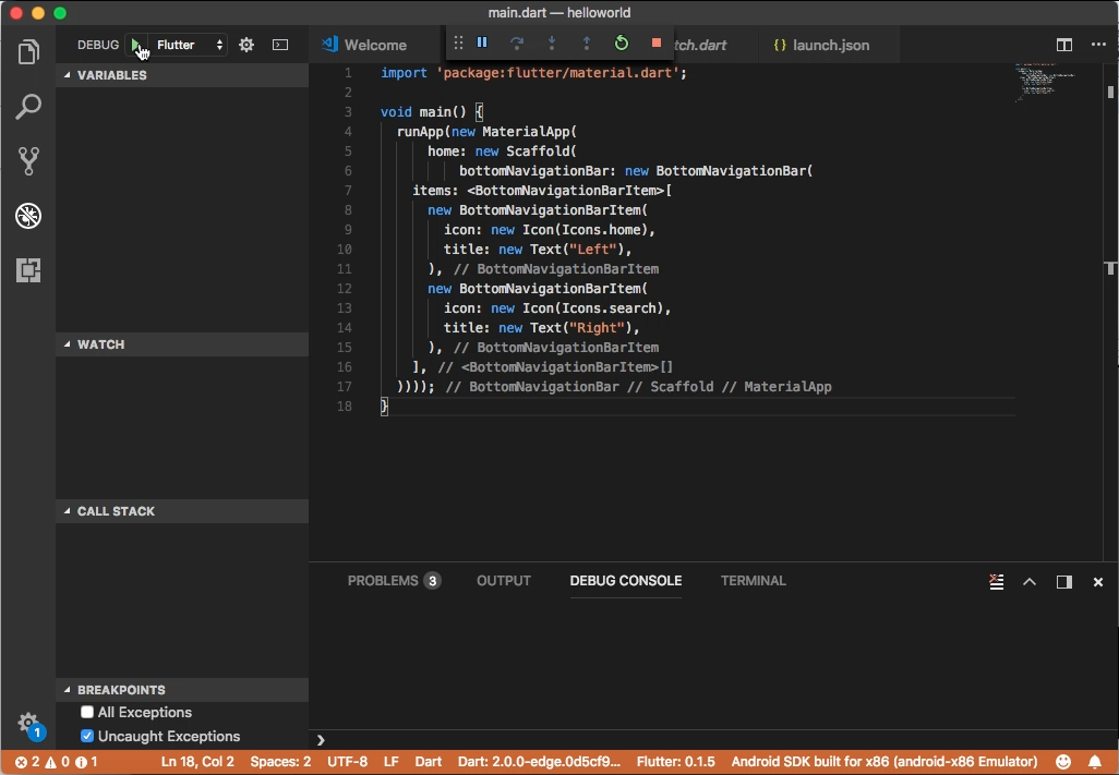
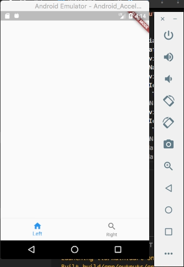
設定 bottomNavigationBar 屬性,指定下方的導覽按鈕。
import 'package:flutter/material.dart';

void main() {
runApp(new MaterialApp(
home: new Scaffold(
bottomNavigationBar: new BottomNavigationBar(
items: [
new BottomNavigationBarItem(
icon: new Icon(Icons.home),
title: new Text("Left"),
),
new BottomNavigationBarItem(
icon: new Icon(Icons.search),
title: new Text("Right"),
),
],
))));
}
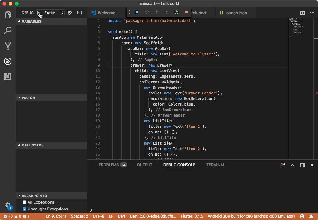
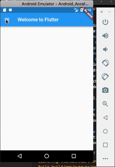
設定 drawer 屬性,指定側邊選單。
import 'package:flutter/material.dart';

void main() {
runApp(new MaterialApp(
home: new Scaffold(
appBar: new AppBar(
title: new Text('Welcome to Flutter'),
),
drawer: new Drawer(
child: new ListView(
padding: EdgeInsets.zero,
children: [
new DrawerHeader(
child: new Text('Drawer Header'),
decoration: new BoxDecoration(
color: Colors.blue,
),
),
new ListTile(
title: new Text('Item 1'),
onTap: () {},
),
new ListTile(
title: new Text('Item 2'),
onTap: () {},
),
],
),
))));
}